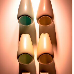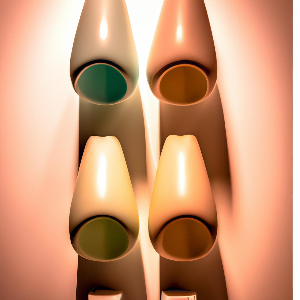
Introduction to Color Psychology in Interior Design
Color psychology is the science of how colors affect human behavior and emotions. Colors can be used to create a certain atmosphere or mood in interior design spaces, such as homes and offices. The concept of color psychology has been around for centuries, with its roots in ancient philosophies and religious beliefs. In today’s modern world, designers continue to use color in order to create balance, harmony, and a sense of well-being in interior design.
By understanding the basics of how colors interact with each other and how they affect our senses, you can create beautiful interiors that inspire and bring joy into people’s lives. This guide will provide an in-depth explanation of how color psychology works in interior design and explain how to use different colors and combinations to create the right ambiance in your home or office space.
Scientific Approach: Understanding Color Psychology in Interior Design
Color psychology is a science that studies the effects of colors and its symbolic meanings on humans’ thoughts, feelings and behaviors. It can be used in interior design to evoke certain moods and ambience in different rooms. To apply it effectively, it is important to understand the scientific concepts behind color psychology.
Hue is the essential quality of a color. All hues will create different effects and evoke distinct emotions and responses. For example, a warm yellow hue can create feelings of warmth and happiness, whereas a cool blue hue may induce a sense of serenity.
Value indicates the lightness or darkness of a given color. Different values can create different visual and psychological effects. Low-value shades convey depth, while high-value tints may appear closer than they actually are.
Chromaticity refers to the saturation of a color. Highly saturated colors tend to stand out and be more intense; whereas muted, desaturated colors can create a calm effect. Bright colors are energizing and vibrant, while subdued colors such as grays, taupes and beiges can create a more serene atmosphere.
These three components (hue, value, and chromaticity) come together to form a color wheel. This wheel can be used to determine which colors work well together and can be combined to create dynamic and balanced interior designs.
Practical Uses of Color
Interior design is an art form that relies heavily on color psychology to create a desired mood and atmosphere in a space. Using the correct colors can evoke feelings of peace and comfort or excitement and energy. Knowing how to use colors and what colors evoke which feelings can help designers craft beautiful and tranquil rooms.
When it comes to practical uses of color, it’s important to understand the basics of color harmony. A harmonious color scheme typically combines colors from the same color family, or adjacent hues on the color wheel. Harmonious colors tend to be more calming and comforting than using contrasting colors.
Warm colors such as red, yellow, and orange are associated with excitement and energy. They can be used to invigorate a room but should be used sparingly. Cool colors such as blue, green, and purple tend to be more calming and soothing. They often help to create a relaxing atmosphere where people can unwind and destress.
Neutral colors like beige, tan, and gray provide a sense of balance in a room. They can be used to create a sense of cohesion and unity in the space. Neutral colors are often used as accents amongst other colors to create a timeless aesthetic.
Color can also be used to create an illusion of space. Light colors make a room feel more airy and open while darker colors add depth and visual interest. Monochromatic color schemes make a room look larger while tonal colors create a cozy and intimate atmosphere.
Understanding and utilizing color psychology in interior design can help create a lasting impression on everyone who enters the space. From balanced and harmonious palettes to warm and inviting tones, color psychology is an invaluable tool for all interior designers.
Color Classification
Color psychology is an important part of interior design. Understanding the basics of color classification is the first step to creating dynamic and balanced spaces. There are four main types of color classification – primary, secondary, tertiary and neutral colors.
Primary colors are those that make up all other colors. They are red, yellow and blue. These colors cannot be created by mixing any other colors. The use of primary colors can be used to create vivid looks in a room.
Secondary colors are made by mixing two primary colors together. Orange, green and purple are secondary colors. They are less intense than primary colors but can still be used to create bold designs.
Tertiary colors are created by mixing a primary color with a secondary color. Examples of tertiary colors include olive, peach and lavender. They are softer and more subtle than other colors and can be used to create soothing tones.
Neutral colors can provide a sense of balance in an otherwise colorful space. Neutral colors such as beige, gray and white are often used as a backdrop to highlight other colors in the room.
By understanding the different types of color classifications, designers are able to effectively mix and match colors to create dynamic and balanced spaces that evoke specific moods and emotions.
Tone and Tension: Creating Emotions and Vibes
In interior design, the use of tones and tints is a powerful tool for creating vibes and evoking emotions. With just a few shades of paint, you can instantly alter the atmosphere in a room. Different tones suggest different levels of energy, while certain colors can evoke feelings of comfort and relaxation.
By experimenting with different combinations of tones and tints, you can create a sense of tension or harmony in the space. For example, warm hues can create an energetic environment while cool shades can make a room seem more calm and tranquil. You can also add contrast to a room by pairing a bold color with a muted shade.
The same rule applies when it comes to tints and shades. For example, a light blue tint can create a feeling of peace and tranquillity, while a dark blue shade can evoke feelings of depth and mystery. Each color has its own unique characteristics that can be used to create the desired atmosphere in a space.
Using tones and tints in combination with each other can also be a great way to create visual interest in a room. By introducing lighter and darker shades of a single color, you can give depth to a space and create attractive focal points.
Finally, don’t forget about accents. Adding a few accent colors to your color scheme can give it a fresh look and help to tie the room together. When choosing accent colors, keep in mind the overall tone and mood of the space. For instance, if you want a bright and airy atmosphere, choose light colors such as yellow or pale blue. But if you want more of a cozy feel, opt for richer, warmer hues like red or orange.
Impact of Color
The impact of color on people’s behavior and emotions is undeniable. Colors can evoke both positive and negative feelings, they can make us feel energized or relaxed, and they can even influence our choices. In interior design, it is important to understand how color affects the atmosphere of a room in order to create a lasting impression.
Each color has its own unique properties and its own psychological effects on different individuals. Red, for example, is considered to be a stimulating color that can increase activity and create excitement or tension in a space. Meanwhile, blue is often seen as calming and can bring a sense of harmony and serenity.
Different colors can also be used to create different moods in a room. Bright colors are often used to create an uplifting and vibrant atmosphere, while cooler tones can help to create a relaxed and soothing ambiance. Knowing which colors to use for specific purposes can be a powerful tool for creating the perfect atmosphere.
In addition, the impact of color goes beyond visual stimulation; it can also affect our senses in other ways. For example, warm colors such as orange and yellow can give off a cozy feeling, while cool colors like blue may create an air of calmness. It is important to think about the atmosphere you want to create and select the colors that will best achieve that goal.
By understanding the psychological effects of color, designers can create spaces that evoke the desired emotional response from their guests. By selecting the right colors, designers can create a lasting impression and make the space more enjoyable.
Popular Color Combinations
When it comes to interior design, color combinations can play a powerful role in creating the desired ambience and mood. Let’s take a look at some of the most popular colors used in combination today and how they impact the feel of the space.
A common classic combination is the use of white and blue. This combination creates a look of elegant simplicity and is often used to evoke feelings of peace, serenity, and calmness. Another popular choice is the blend of black and gray. This combination is known for its ability to create a chic, modern ambience with a subtle note of sophistication.
Orange and green is another great combination that helps to bring a sense of energy and warmth into the home. The use of red and yellow together is also popular as it is often seen as a stimulating combination that can make a room seem more exciting and vibrant.
Lastly, brown and beige are often used together to provide a feeling of comfort and familiarity. These colors are generally seen as more natural and earthy, adding a cozy, inviting atmosphere to any room.
Overall, the chosen combination of colors can have an immense impact on the overall mood and feel of any room. Careful consideration should be given to the colors you choose before beginning the interior design process to ensure that the desired vibe is achieved.
Conclusion
The study of color psychology can be highly beneficial when it comes to interior design. By understanding the scientific principles of color psychology as well as the practical application of specific colors in different settings, you can create a space that is both visually pleasing and emotionally inviting. Whether you are looking to create an atmosphere of serenity, energy, or balance, this guide has shown that the proper use of colors can have a transformative effect on any environment.
By understanding the primary colors, the various color tones and tints, and popular combinations, you can take full advantage of the psychological and emotional power of color. Additionally, it is important to understand the potential impact that colors can have on individual behavior in any given setting. Use the knowledge gained from this guide to create a stylish and inviting home, office, or other space with the help of color psychology.
comments: 0